Toast TakeOut, a food ordering app, is looking for help. Toast TakeOut allows users to order ahead from restaurants in their neighborhood for either pickup or delivery. Users are often indecisive about what they want to eat and would appreciate a feature that offers suggestions. This feature would tailor suggestions by asking users questions about their food preferences as well as rate previous orders.
Design a feature that suggests restaurants and/or dishes to the user. A quiz or survey would allow their suggestions to be more customized.
I designed a feature that asks the user if they would like the app to offer a suggestion. A short questionnaire is meant to make the suggestion specific to the user.
I completed this project for DesignLab's UX Academy. While Toast is a real company, this is not a real feature for Toast.
With the lockdowns in the year 2020 due to COVID-19, I assumed there was an increase in food ordering through various apps. I also assumed people don't always know what they want to order when they open the app. You know what they say when you assume...research, of course! Are people as indecisive about what they want to eat as I am? To begin, I uploaded several popular food ordering apps and analyzed the strengths and weaknesses of each. I noted the similarities and differences in a competitive analysis.
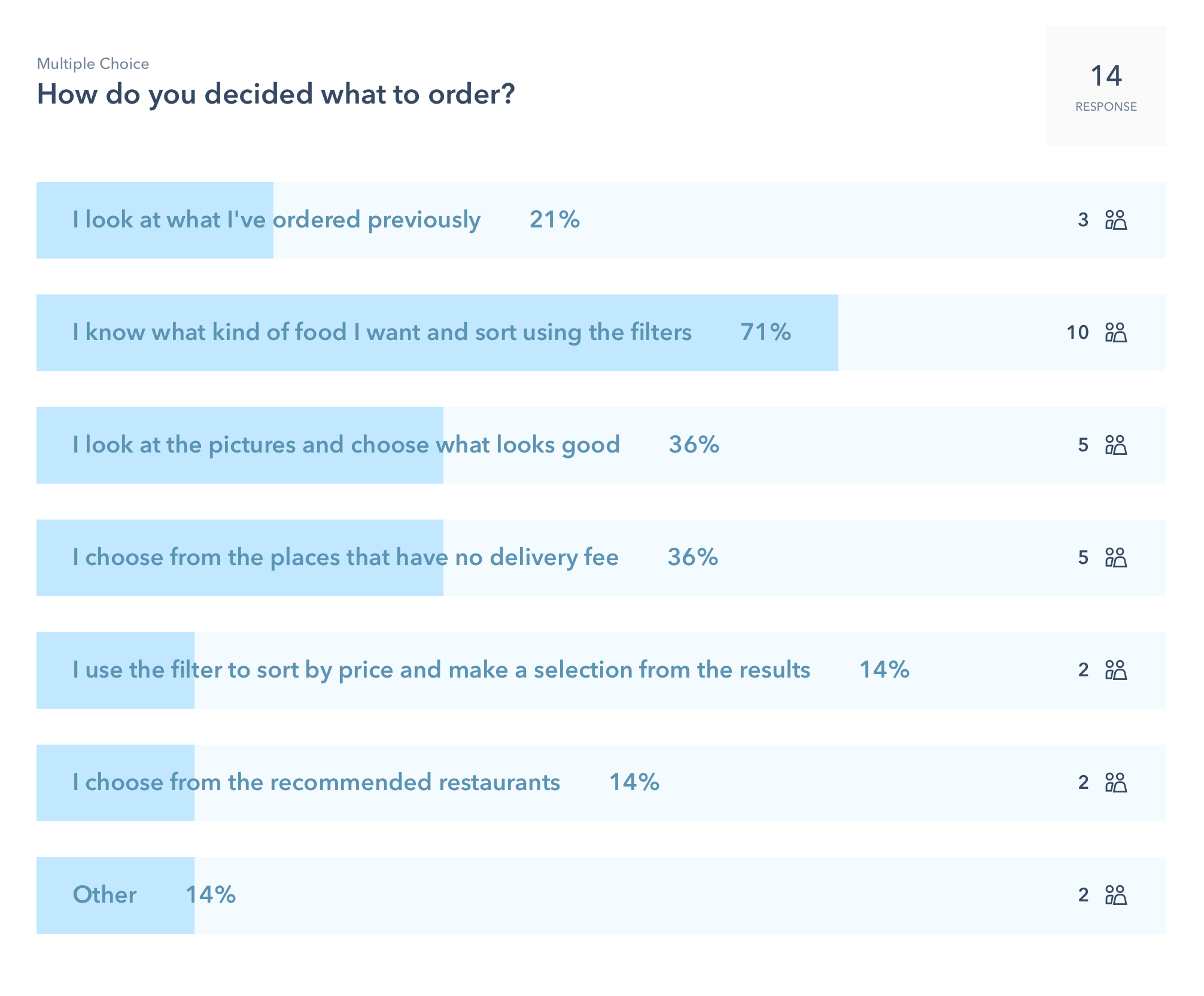
To be sure I would be designing for an existing problem, I conducted a survey to gather data. My goals were to discover how often people order food through food ordering apps, what makes them use one app over another, and how they determine what to eat.


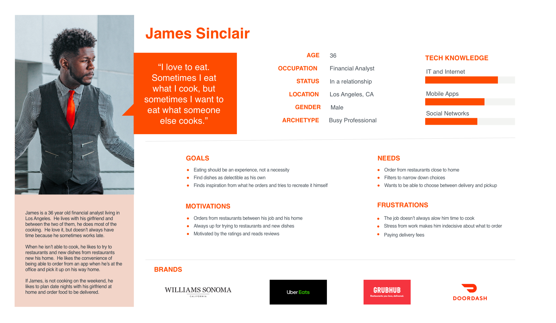
Using the demographics data I gathered during the survey, I created a persona to represent the Toast user. James' work hours sometimes leaves him little time to cook and restaurants in California are open for pickup or delivery only, so he orders food through Toast.
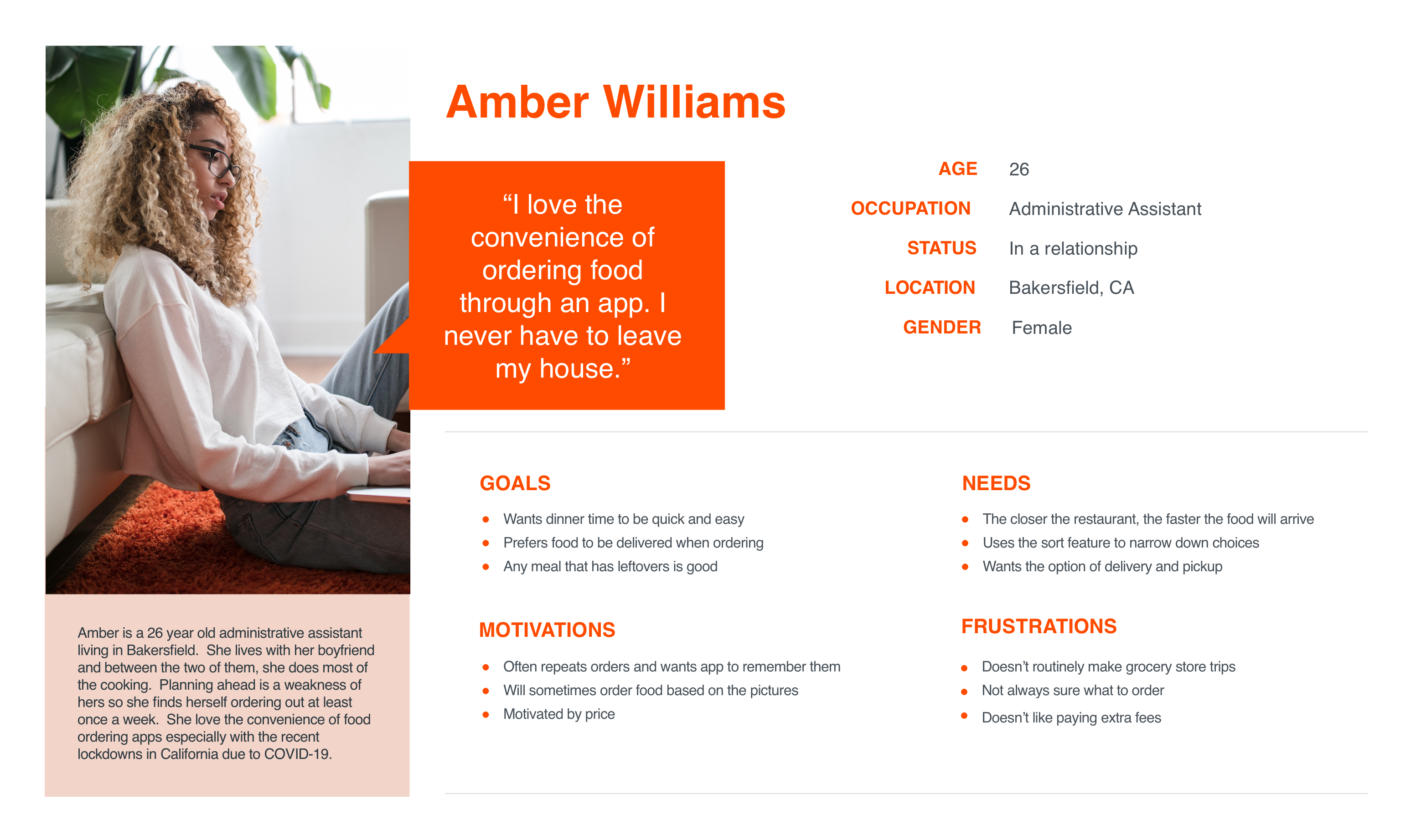
Further research led me to create a second persona. I discovered that the biggest users of food delivery apps were the low income and the young. In a survey conducted by Zion & Zion, they found 63% of the consumers surveyed were between the ages of 18 and 29. They also found the less income a consumer earns, the more likely the consumer is to take advantage of restaurant delivery services. The lowest incomes have the highest usage: 51.6% for those earning less than $10k per year, and 44.6% for those earning $10k to $24.9K. Amber is more representative of this data.
To determine how the current app was organized and where to add the feaure to meet user needs, I created a site map to visualize the structure. My first thought was to put recommendations towards the top under the "get it again" section. Later, I added a suggestion button toward the bottom after the user has scrolled through several restaurant options. The idea being the more a user scrolls, the more undecided they may be.

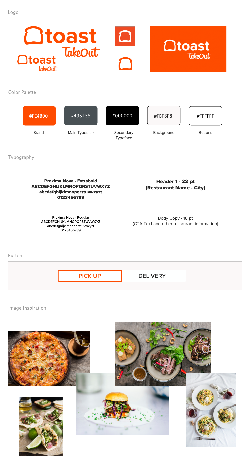
The style tile helped to establish the UI elements needed to seamlessly integrate a new feature with the existing UI. The goal was for the feature to be invisible until it needed to be noticed. A UI kit further defined the brand with icons, navigation and other design patterns.

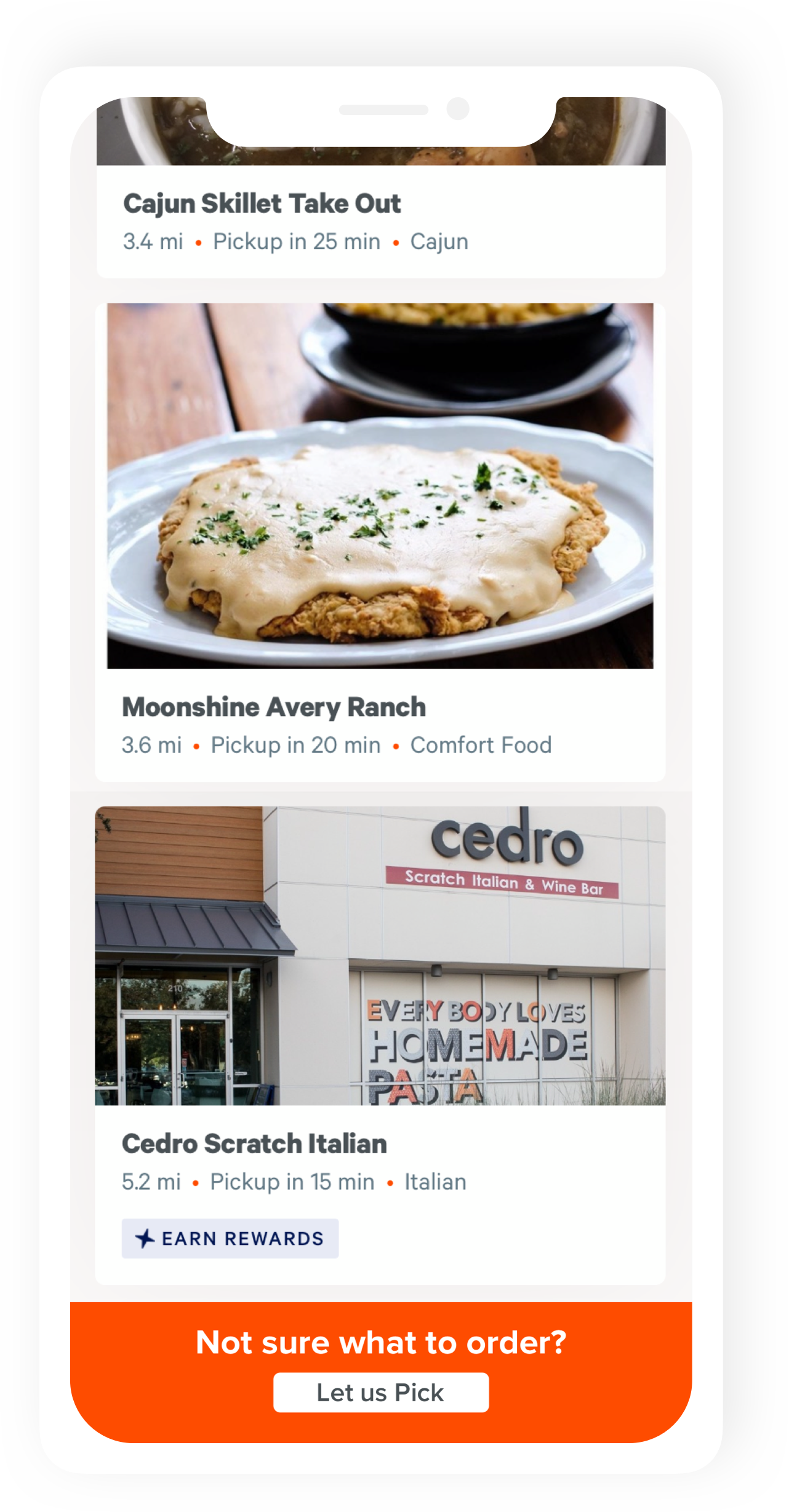
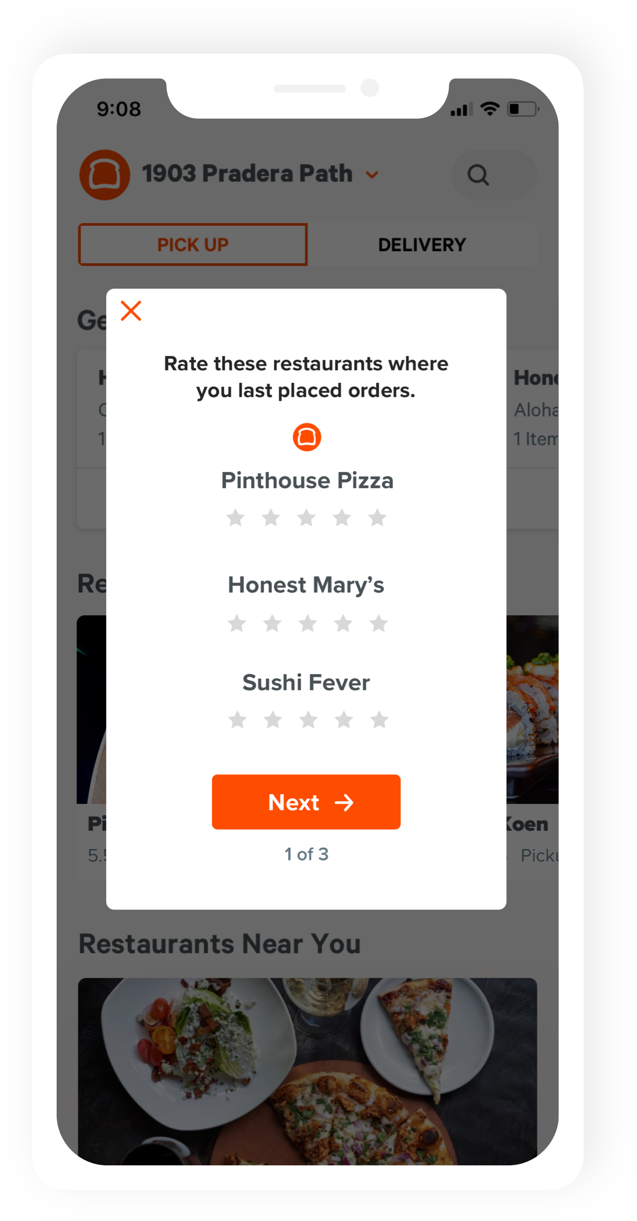
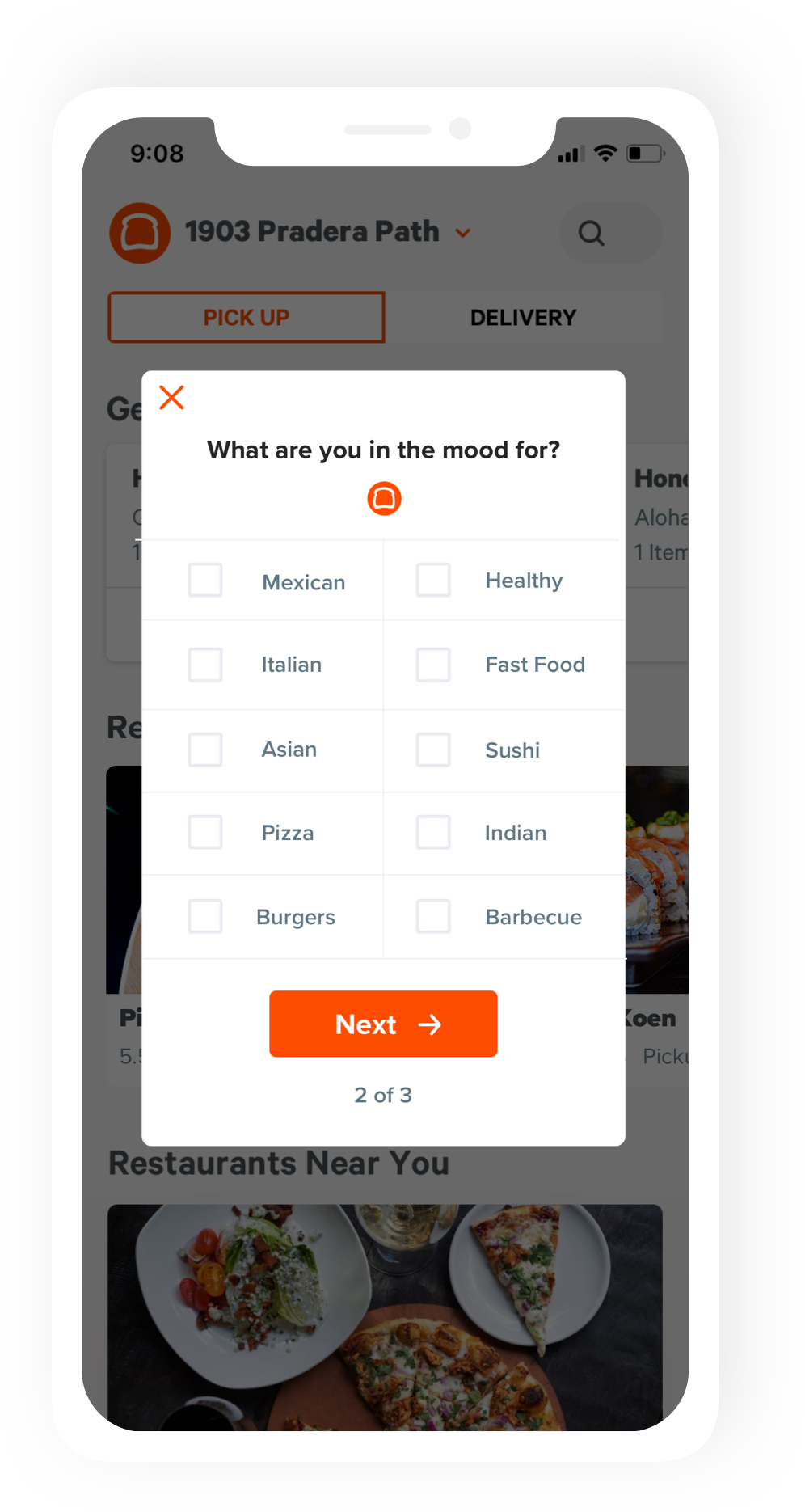
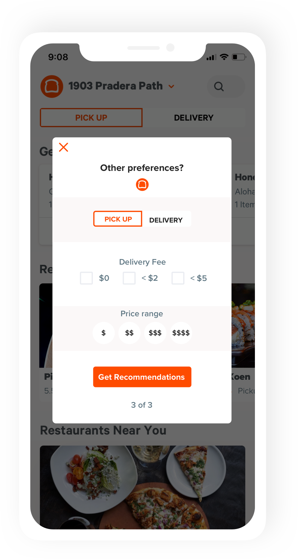
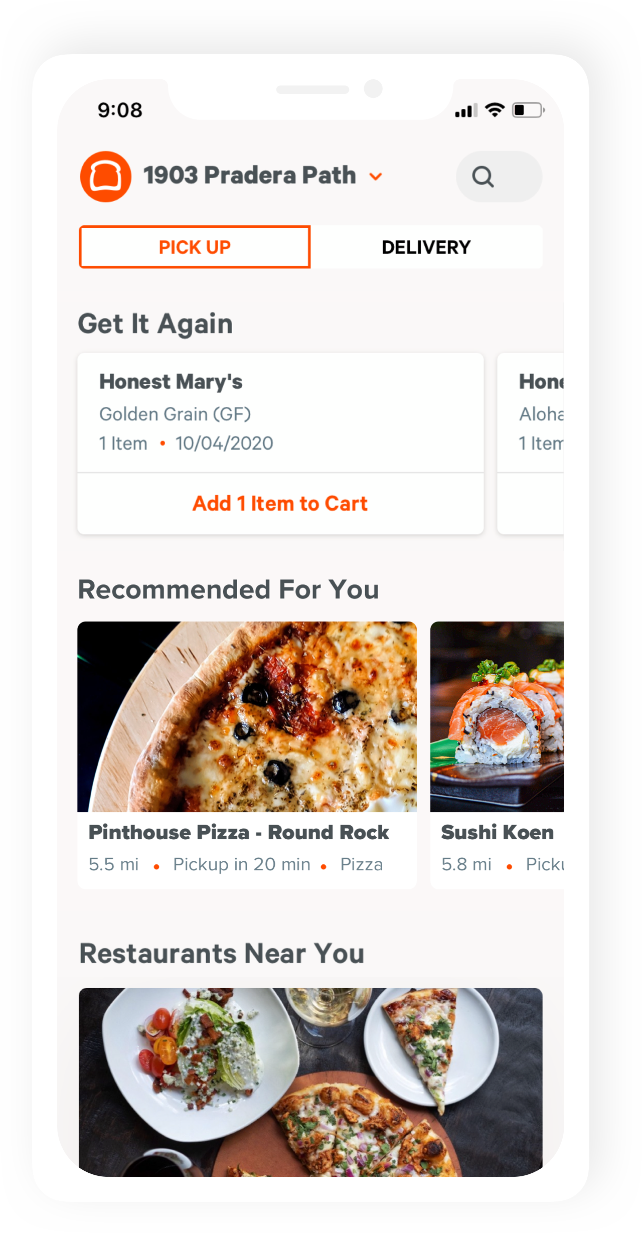
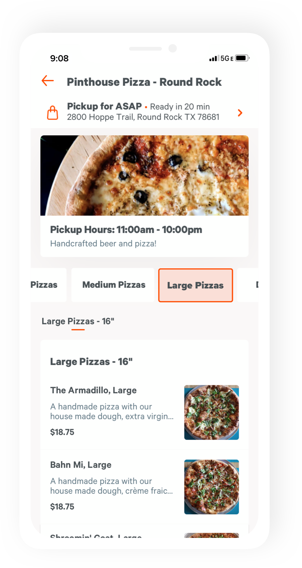
These hi-fidelity wireframes show the final design of the feature. After the user scrolls through a few restaurant options, a bright orange box would appear and call attention to the possibility the user is unsure of what to order. Tapping "Let us Pick" would lead the user to a series of three quick questions intended to customize the recommendation for that particular user. Finally, tapping "Get Recommendations" would take the user back to the home screen where there's a "Recommended For You" section.

I conducted unmoderated usability tests using Maze. Eight participants completed the test. I asked them to complete a series of tasks using the prototype.
Following the tasks, I asked open ended questions about their experience. I wanted to know if they thought the placement of the CTAs made sense, if they experienced any frustration or confusion, and their overall ease of use and initial impression.
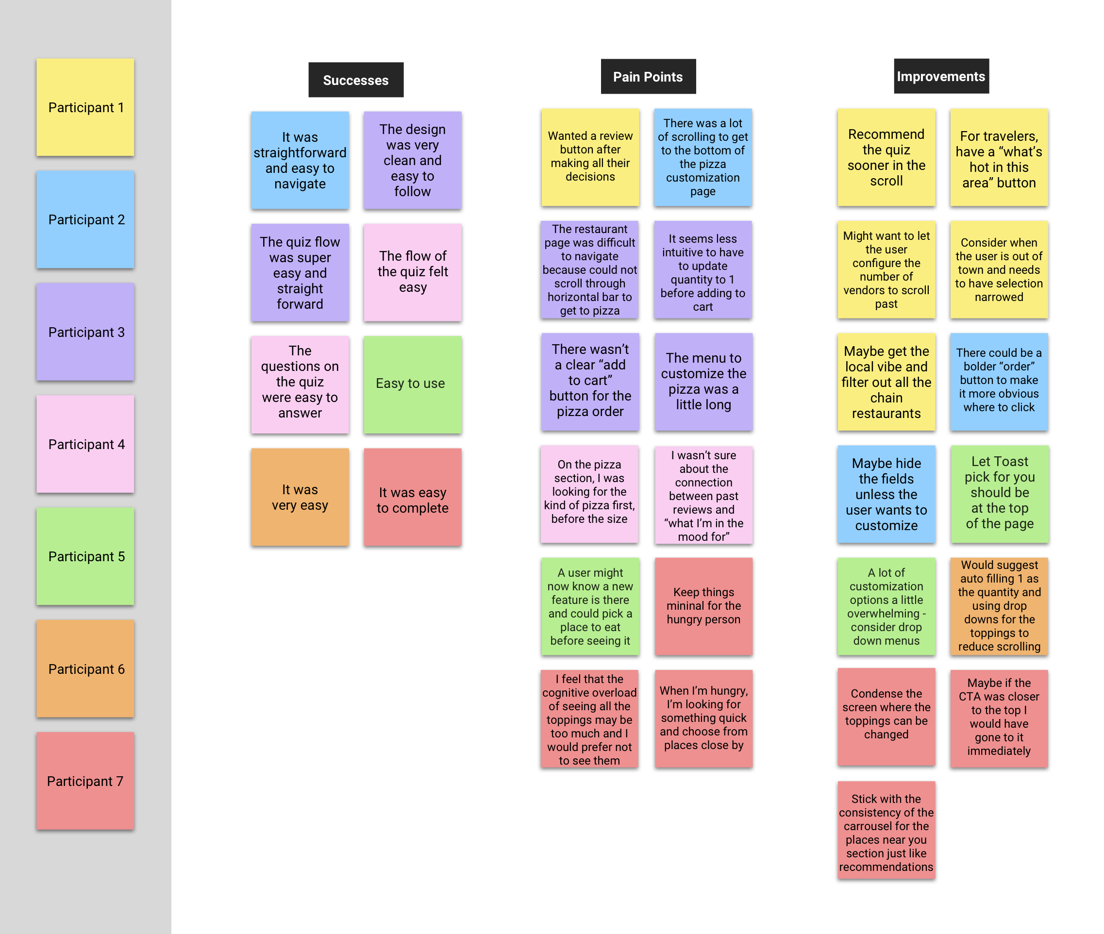
The results of user testing showed the following and would guide me in iterating the project had it continued past the first round of testing:
Overall, this project taught me how to work within the constraints of an existing product, relying on already present design patterns and components. Since users are already familiar with these conventions, breaking with them could hurt usability.